VisLink: Revealing Relationships Amongst Visualizations
Wolfgang Knecht
| start |
|---|
| GUI |
| dataset |
| visualization |
| linking |
| navigation |
| documentation |
The major advantage is the ability to adapt new visualization techniques. Every other method can be added and used to illustrate other aspects of relation between data items. All planes have a basic class where they derived from. Planes are rendered by FBOs between the range of 0 and 1. At this implementation stage the following three visualizations are available:
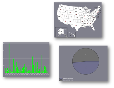
- map
The map shows all states of US and provides a geographical overview of data. Implementation of a map plane is trickier because every single middle point of each state is estimated by hand. Due to the uneven national boundaries the selection of one state is more costly. - bar chart
A bar chart illustrates the different values of one selected item. To be as flexible as possible a new data type is used to distinguish between percent and float. If data is given by percent a base of 100 is used in contrast to float. In that case the new base is defined by the highest value of the chosen data column. If electors are selected the highest value is for example 55. - pie chart
By the help of a pie chart users may get an overview of the percentage distribution of selected items. The pie chart uses the fact that sinus and cosine of the unit circle defines x and y position. One segment is defined through the start and the end angle. Color is estimated more or less randomly. First two different values between 0 and 255 are selected. Then 8 permutations of these two values are calculated. For that reason we can assure that 8 different color values are visible. It is also possible to calculate more than 8 colors but the probability of similar color increases. If this case occurs the legend is also highlighted and a distinction is possible.