

Manuela Waldner , Alexandra Diehl, Denis Gracanin, Rainer Splechtna, Claudio Delrieux, Kresimir Matkovic
A Comparison of Radial and Linear Charts for Visualizing Daily Patterns
IEEE Transactions on Visualization and Computer Graphics, 26:1033-1042, October 2019. [ paper]
Information
- Publication Type: Journal Paper with Conference Talk
- Workgroup(s)/Project(s):
- Date: October 2019
- Journal: IEEE Transactions on Visualization and Computer Graphics
- Volume: 26
- Location: Vancouver, Canada
- Lecturer: Manuela Waldner
- Event: IEEE VIS InfoVis
- DOI: 10.1109/TVCG.2019.2934784
- Call for Papers: Call for Paper
- Conference date: 20. October 2019 – 25. October 2019
- Pages: 1033 – 1042
- Keywords: radial charts, time series data, daily patterns, crowd-sourced experiment
Abstract
Radial charts are generally considered less effective than linear charts. Perhaps the only exception is in visualizing periodical time-dependent data, which is believed to be naturally supported by the radial layout. It has been demonstrated that the drawbacks of radial charts outweigh the benefits of this natural mapping. Visualization of daily patterns, as a special case, has not been systematically evaluated using radial charts. In contrast to yearly or weekly recurrent trends, the analysis of daily patterns on a radial chart may benefit from our trained skill on reading radial clocks that are ubiquitous in our culture. In a crowd-sourced experiment with 92 non-expert users, we evaluated the accuracy, efficiency, and subjective ratings of radial and linear charts for visualizing daily traffic accident patterns. We systematically compared juxtaposed 12-hours variants and single 24-hours variants for both layouts in four low-level tasks and one high-level interpretation task. Our results show that over all tasks, the most elementary 24-hours linear bar chart is most accurate and efficient and is also preferred by the users. This provides strong evidence for the use of linear layouts – even for visualizing periodical daily patterns.Additional Files and Images
Additional images and videos
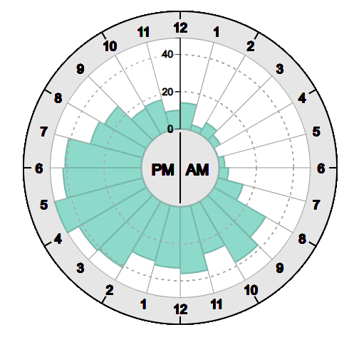
teaser:
Daily patterns visualized in a 24-hours radial chart.

Additional files
 slides :
Powerpoint slides of presentation at IEEE VIS 2019 (do not contain animations and videos).
slides :
Powerpoint slides of presentation at IEEE VIS 2019 (do not contain animations and videos).
 supplement:
Supplemental information about the user study
supplement:
Supplemental information about the user study

Weblinks
BibTeX
@article{waldner-2019-rld,
  title =      "A Comparison of Radial and Linear Charts for Visualizing
               Daily Patterns",
  author =     "Manuela Waldner and Alexandra Diehl and Denis Gracanin and
               Rainer Splechtna and Claudio Delrieux and Kresimir Matkovic",
  year =       "2019",
  abstract =   "Radial charts are generally considered less effective than
               linear charts. Perhaps the only exception is in visualizing
               periodical time-dependent data, which is believed to be
               naturally supported by the radial layout. It has been
               demonstrated that the drawbacks of radial charts outweigh
               the benefits of this natural mapping. Visualization of daily
               patterns, as a special case, has not been systematically
               evaluated using radial charts. In contrast to yearly or
               weekly recurrent trends, the analysis of daily patterns on a
               radial chart may benefit from our trained skill on reading
               radial clocks that are ubiquitous in our culture. In a
               crowd-sourced experiment with 92 non-expert users, we
               evaluated the accuracy, efficiency, and subjective ratings
               of radial and linear charts for visualizing daily traffic
               accident patterns. We systematically compared juxtaposed
               12-hours variants and single 24-hours variants for both
               layouts in four low-level tasks and one high-level
               interpretation task. Our results show that over all tasks,
               the most elementary 24-hours linear bar chart is most
               accurate and efficient and is also preferred by the users.
               This provides strong evidence for the use of linear layouts
               – even for visualizing periodical daily patterns.",
  month =      oct,
  journal =    "IEEE Transactions on Visualization and Computer Graphics",
  volume =     "26",
  doi =        "10.1109/TVCG.2019.2934784",
  pages =      "1033--1042",
  keywords =   "radial charts, time series data, daily patterns,
               crowd-sourced experiment",
  URL =        "https://www.cg.tuwien.ac.at/research/publications/2019/waldner-2019-rld/",
}