

Guangping Li, Soeren Nickel, Martin Nöllenburg, Ivan Viola , Hsiang-Yun Wu
World map of recipes
[ poster]
Information
- Publication Type: Unknown Publication
- Workgroup(s)/Project(s):
- Date: 2019
Abstract
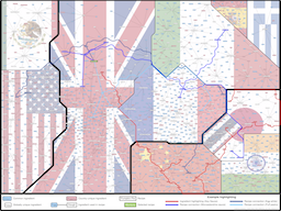
This poster visualises the Meal Ingredients dataset with 151 international food recipes and their corresponding ingredients. The underlying graph layout in the image is automatically generated using a new multi-level force-based algorithm developed by the authors, but not yet published. The background flags were added manually to identify the countries from the data set. The algorithm aims to untangle mutually nested subgraphs by harmonizing the available space for the labels and improving edge visibility by duplicating high-frequency ingredient nodes. Ingredients occurring in multiple countries also receive at least one node per country. The idea is inspired by map diagrams, which often show the semantics enclosed by country boundaries. In our diagram, countries are represented by octolinear polygons, and are placed next to each other if they share many ingredients in their recipes. The actual placement of the countries by the algorithm is entirely data driven. As we can see, this design naturally gathers countries that are located on the same continent, due to the accessibility of the ingredients. The names of recipes are visualized using textual labels with sharp corners, and they are enclosed by the country polygon they belong to. Contrarily, ingredients are represented by textual labels with rounded corners. Moreover, ingredients are visually classified into common (pink) and special (blue) ingredients based on their frequency in the dataset. For visually analyzing the data set, we can generate smoothed spanning trees along the boundaries of an (invisible) Voronoi diagram of all textual labels to connect identical nodes to visually integrate all copies of one ingredient. For example, we highlighted the ingredient "soy sauce", one of the most commonly used ingredients in Asia, to discover that it has spread to the UK as well. We can also perform visual queries for related recipes based on sharing rare ingredients. For example, the British dish "steak and kidney pie" is highlighted in green together with three blue spanning trees connecting all recipes related to that dish via at least one of its special (blue) ingredients.Additional Files and Images
Additional images and videos
image:
1st Place Award, Creative Topic-"Meal Ingredients", of the 28th Annual Graph Drawing Contest
Additional files

Weblinks
BibTeX
@unknown{li-2019-gdc,
  title =      "World map of recipes",
  author =     "Guangping Li and Soeren Nickel and Martin N\"{o}llenburg and
               Ivan Viola and Hsiang-Yun Wu",
  year =       "2019",
  abstract =   "This poster visualises the Meal Ingredients dataset with 151
               international food recipes and their corresponding
               ingredients. The underlying graph layout in the image is
               automatically generated using a new multi-level force-based
               algorithm developed by the authors, but not yet published.
               The background flags were added manually to identify the
               countries from the data set. The algorithm aims to untangle
               mutually nested subgraphs by harmonizing the available space
               for the labels and improving edge visibility by duplicating
               high-frequency ingredient nodes. Ingredients occurring in
               multiple countries also receive at least one node per
               country. The idea is inspired by map diagrams, which often
               show the semantics enclosed by country boundaries. In our
               diagram, countries are represented by octolinear polygons,
               and are placed next to each other if they share many
               ingredients in their recipes. The actual placement of the
               countries by the algorithm is entirely data driven. As we
               can see, this design naturally gathers countries that are
               located on the same continent, due to the accessibility of
               the ingredients. The names of recipes are visualized using
               textual labels with sharp corners, and they are enclosed by
               the country polygon they belong to. Contrarily, ingredients
               are represented by textual labels with rounded corners.
               Moreover, ingredients are visually classified into common
               (pink) and special (blue) ingredients based on their
               frequency in the dataset.  For visually analyzing the data
               set, we can generate smoothed spanning trees along the
               boundaries of an (invisible) Voronoi diagram of all textual
               labels to connect identical nodes to visually integrate all
               copies of one ingredient. For example, we highlighted the
               ingredient "soy sauce", one of the most commonly used
               ingredients in Asia, to discover that it has spread to the
               UK as well. We can also perform visual queries for related
               recipes based on sharing rare ingredients. For example, the
               British dish "steak and kidney pie" is highlighted in green
               together with three blue spanning trees connecting all
               recipes related to that dish via at least one of its special
               (blue) ingredients.",
  month =      sep,
  URL =        "https://www.cg.tuwien.ac.at/research/publications/2019/li-2019-gdc/",
}