

Image
Publication
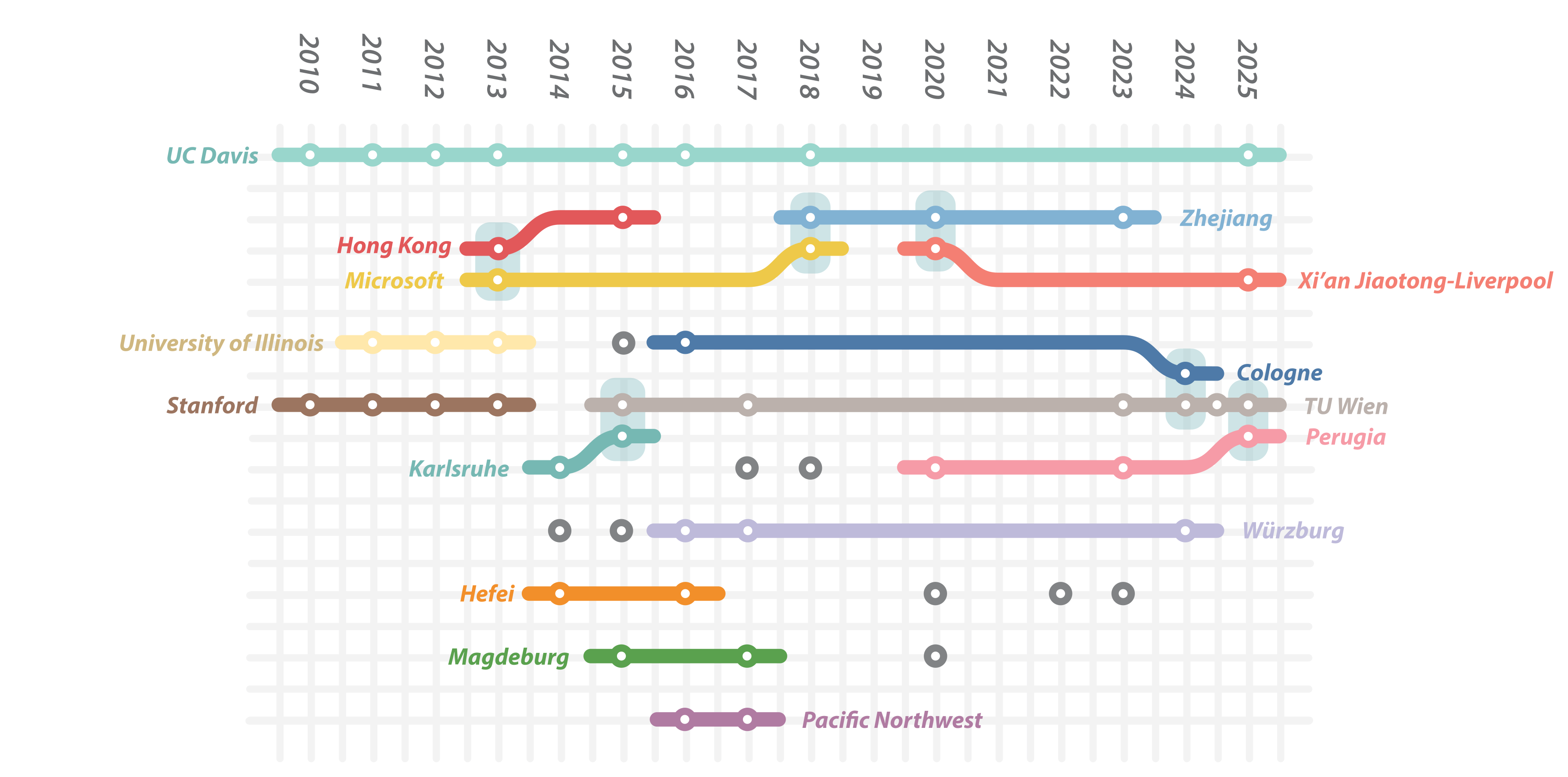
This image has been taken from the following publication:| 2026 | ||
 |
Sara Di Bartolomeo , A. Dobler, Velitchko Filipov, Martin Nöllenburg, Henry Ehlers , A. Dobler, Velitchko Filipov, Martin Nöllenburg, Henry EhlersThe Story(line) So Far: A Survey on Storyline Visualization In EuroVis 2026: 28th Eurographics Conference on Visualization 2026. June 2026. [  paper] paper] |
Conference Paper |