Examples
The Multi-Scale implementation has already been tested with several datasets. You can see all the examples described here by loggin into our TIS server at http://193.171.60.18/TIS2005/WebApp/default.aspx as user TUStudent with password vienna. Due to a bug in the Microsoft ASP.NET Ajax extensions, TIS only works to 100 percent with Internet Explorer yet. It also is a nightly build, because the ChartLibrary has just been finished. Therefore, it might not be perfectly stable.
For new users, TIS is a little bit hard to understand. To solve this problem, XIMES hosts a Wiki. Refer to this Wiki if you have problems.
Gallery
The following gallery shows several example visualization without needing a TIS server. However, in TIS you would be able to reconfigure them interactively and see actual values by moving the mouse over the visualization.Police Dataset
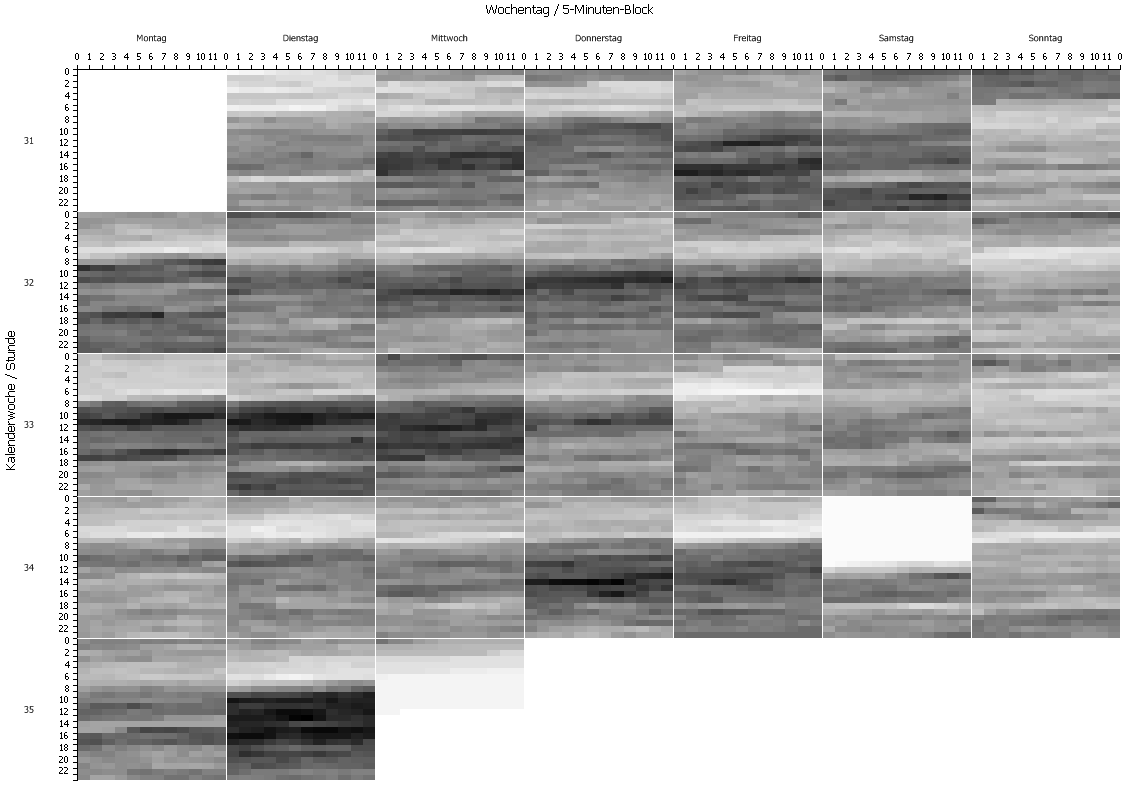
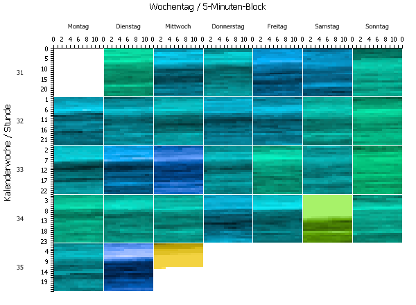
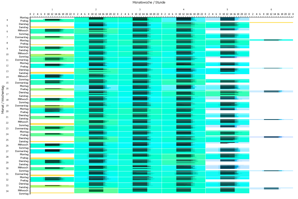
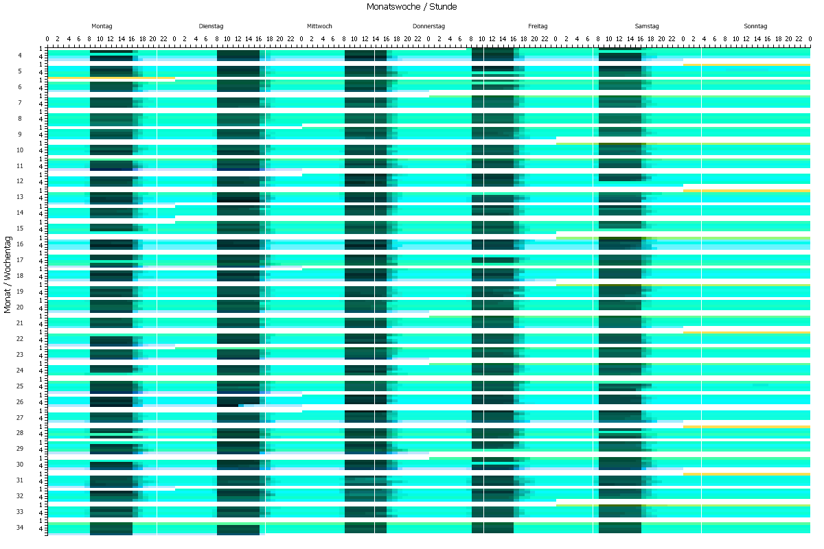
The first dataset used for Multi-Scale shows police assignments over the course of one month. Several insights have already been found by using th Multi-Scale visualization prior to the implementation as a TIS graphics operator. For example, the Thursdays are more alike, while there is a bigger variance between Saturdays. Another exmple is that the Monday of the 33th calendar week is quite similar to the Tuesday or Wednesday of the same week even if they have a different total of assignments. A very quiet night from Sunday to Monday hides that fact if you only look at the aggregated values.
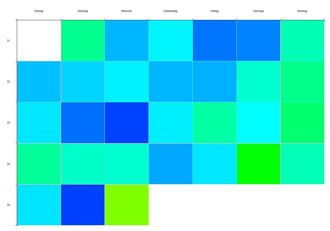
One of the first improvements of our Multi-Scale implementation over Shimabukuro's approach is the possibility to integrate the overview and the detail graph into one visualization. This is done by using the hue channel for overview and the value channel for detail.
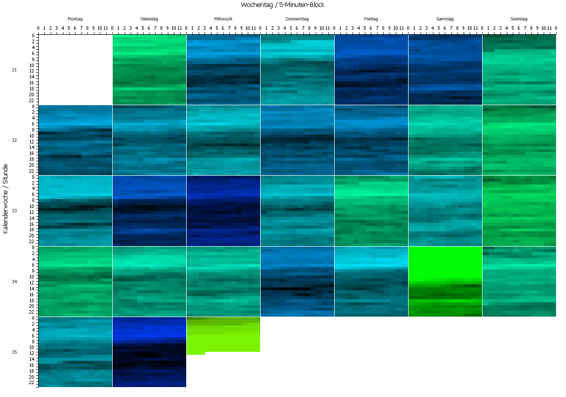
We have also been able to employ the CIELUV color space for a color display which is more homogeneous for the human eye. It also makes high values (dark areas) more distinguishable regarding hue.
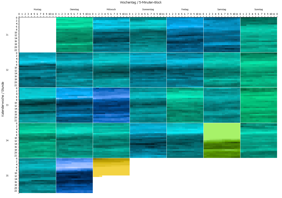
Other aspects of using colors like the the saturation or chroma channel have been tested and soon be implemented.
While the Multi-Scale examples and the gallery on this website are optimized for larger displays, many TIS users have smaller ones. Therefore, the visualization has to be scaleable and the axis have to adapt automatically.
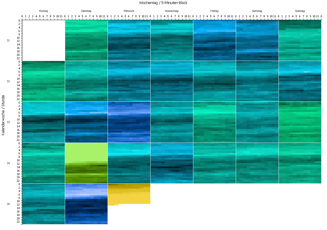
It is possible to invert every other row of blocks. We still have to find a proper solution for the axis, but advantage of this unusual layout is that each block is touching the blocks that represent the day before and after. The same can be done for each row inside of a block (not shown here).
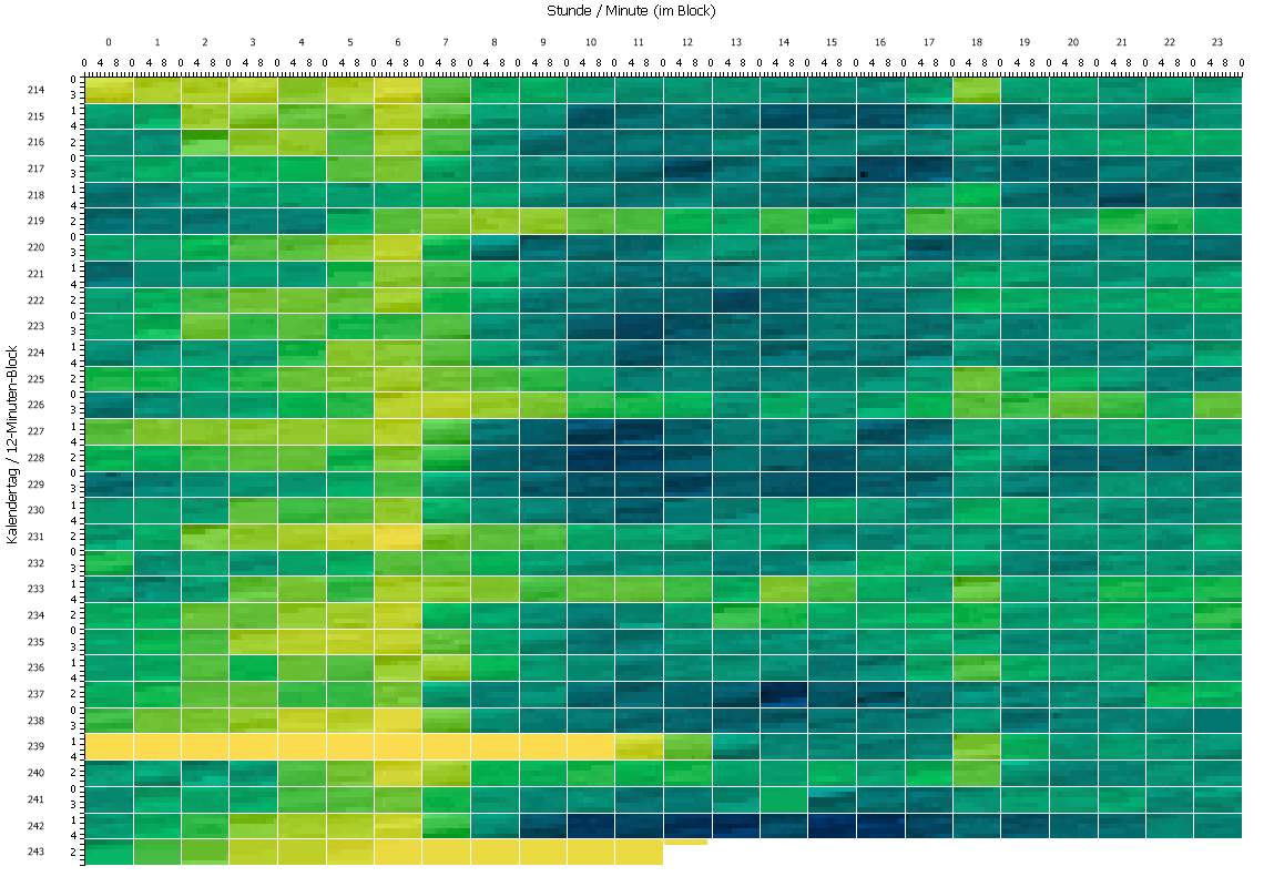
Another possibility if making a one minute raster off the data and show a block for each our. Inside each block, the hour is arranged in 12-minute-windows.
Clinic Dataset
Other datasets we used are from the health care sector. One shows the work shifts of a clinic. This dataset is going over a much longer span than the one from the police. Therefore, one month has to be selected by TIS operators. In future versions, multiple page views with back and forward buttons will provide easier access to granules.

This dataset shows how the switching of granularities can change the view. At the moment, the mapping of the granularities has to be done by upstream TIS operators. In future versions, it will be configurable right from the visualization.
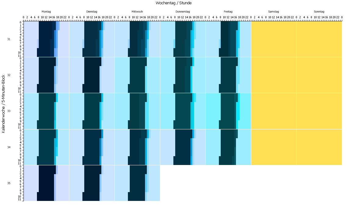
The whole clinic data set can be shown a once by aggregating to full hours, using days per week, week per month and month (counted from beginning to end) as granularities.
This division of granularities upon the dataset is also well-suited for a different arrangement of the data where no blocks are used, but the finer granularities are placed on the horizontal axis and the coarser granularities are placed on the vertical one.
Many datasets are still waiting to be explored and many more settings are going to be implemented in the near future. Looking again on these pages will be worthwhile!