parvis was the name of the first pilot of the HELIOS spaceship, explorer of alien worlds. [Lem 2000]
parvis is a tool for parallel coordinate (PC) visualisation of multidimensional data sets, as first described in [Inselberg 1981]. The main goal is to develop a flexible, reusable user-interface component compliant to the Java Swing [Eckstein et al. 1998],[Fowler 1998] and Java Beans [Sun 2001] standards, to perform state of the art PC visualisation and provide the user with the necessary means of visual interaction with the data set. A stand-alone application with the visualisation component and additional user-interface components will be provided.
The main problem with visualisation of multidimensional (that is: 4+ dimensional) data sets is that human perception operates in a three-dimensional space with orthogonal coordinates - any data set of higher dimensionality has to be mapped or projected into this three dimensional space to be explored by humans. This projection necessarily implies a loss of information and/or clarity, because there are only three space (or "extrinsic") dimensions available, and the exceeding information has to be either omitted or mapped to "intrinsic" dimensions or properties of the projected data point (like color or size, for example). For some problems this might be a feasible approach or event the most intuitive way of visualisation. For other problems, the asymmetry between extrinsic and intrinsic coordinates is not at all intuitive or even misleading.
The currently available output devices for computer generated visualisations only worsen the problem: practically all available output technology is purely two-dimensional (screens, printers, plotters), and so the three-dimensional mapping of the data set has to be projected again onto a 2d projection surface, again causing data loss and possible confusion. Emerging 3d output technology might solve this problem in the future, but these systems are nowhere near the production quality and availability of current 2d-output media. (after all, the need for a printout of your visualisation results will probably be a stable requirement for the next few decades).
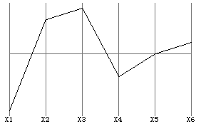
Enter parallel coordinates. With PCs, you do not even try to map your n-dimensional problem into 2- or 3-dimensional orthogonal space. Instead, all the coordinate axes xn of you problem are arranged parallel along the x-axis of (regular) 2d-space. A single point in cartesian space is then represented by a profile of lines connecting all the coordinates of the point in PC space (fig. 1).
To represent a line in PCs, we first construct a few grid points on the line in cartesian space:
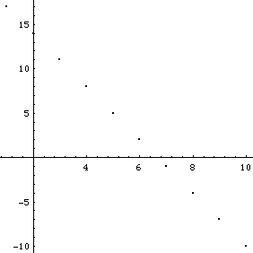
If we map these points to PC space, we get the following plot:
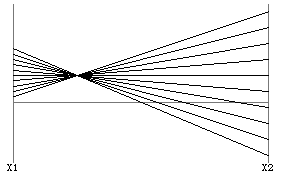
Note how all the "lines" (representing points) in PCs intersect at a common point. In general, a two dimensional line, x2=mx1+b, is represented by the point (1/(1-m),b/(1-m)) in PCs (m != 1). There is a bidirectional mapping between points in cartesian coordinate space and lines in PC space and vice versa.
The main advantages of PC visualisation is that the number of dimensions is only limitded by horizontal screen space and that correlations of variables can be easily spotted. The display of complex datasets in PC space gives an intuitive overview of properties of the dataset that might not be obvious or not visible at all in other visualisations. Complex querys can be formulated graphically by selecting regions or locations on the coordinate axes, possibly combining single operations to complex queries (see below for a discussion of some extensions to interactively query and manipulate the display.)
The basic plotting algorithm might provide good visual insight into some high-dimensional data mining & analysis problems. In addition, several extensions and improvements have been proposed to enhance a PC plot.
For the first visualisation of a data set the system would probably be configured to scale the axes according to the range of values in the data set, showing all data in maximum magnification. In some cases, especially in combination with brushing or filtering (see below), it might be useful to be able to zoom in on specific regions or to zoom out again to gain overview. Negative scaling, which results in a mirroring the orientation of the axis, should also be possible.
For intuitive visual datamining the ordering of the axes in PC space is very important. Ideally, every combination of two adjacent axes should be available in the plot, and [Bolorfoush & Wegman 1988] show that for N = 2n dimensions exactly n "well chosen" displays are sufficient to cover all combinations of direct neighbours. "For example, for N=6 the permutations 126354, 231465, 342516 contain every possible pair (independent of the order) of adjacent subscripts from 1 to 6." [Inselberg & Dimsdale 1990]
For a PC visualisation system, it is desireable to offer the user an automatic way of creating these permutations as well as offer a direct way of manually reordering the axes.
"Brushing" a data set means highlighting a specific subset of the data in a particular color or grayscale value. For example, the user could select a range of values on one axis, and all the points (= PC profiles) that lie within this range are highlighted in a specific color. By repeating this process on the same or different axes, the user could incrementally narrow the data set to gain overview and visual insight into the correlations between the variables.
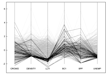
Filtering would be the opposite of brushing, selected subsets of the data could be grayed out or hidden by the user. Fig. 4 shows a large dataset displayed with a filter applied.
A hypersurface in multidemensional parallel coordinate space is represented by calculating the envelope of the collection of polygonal lines representing its points [Inselberg & Dimsdale 1990].
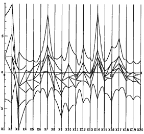
If the user choses a value for one of the coordinates, a new envelope can be calculated reflecting the new range of values that lie within the hypersurface under the constraint of the chosen value(s). In this way the PC display acts as a kind of "instrument panel" for adjusting multidemensional parameter values interactively.
[Rubik 1997] presents the idea of shifting the origin of the 2d drawing surface along the z-axis of 3d space for every point, therefore creating a three-dimensional surface instead of a bunch of lines. Although this method gives a nice 3d object that might impress the outsider, its advantages for visual data analysis have yet to be evaluated.
One problem with PC displays is that they can get extremely complex and cluttered when the number of data points increases. Filtering and brushing are two methods mentioned to reduce the complexity or increase the clarity of a PC display, but both of these focus on subsets of the data and not on overview, which is one of the strengths of PC visualisation.
[Fua et al. 1999] propose a clustering approach to reduce the complexity of the display and still be able to overview the whole data set. A cluster of lines is represented by a line denoting the average vale of the cluster, and by regions of decreasing opacity above and below this line representing the other values in the cluster.
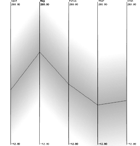
By selecting individual clusters or intervals the user can then drill down from an overview perspective to the detailed view of the individual data points.
Can be found here.
Parvis can be downloaded from http://www.mediavirus.org/parvis/.
No user manual yet - sorry. Start parvis (java -classpath parvis.jar org.mediavirus.parvis.ParvisMain), load a data file (try pupils.stf for a simple file to start), and try to find out what you can do ;).
For most of the buttons there are tooltips to explain the functionality. Click on the little arrows to invert the axis orientation.