SkyLens: Visual Analysis of Skyline on Multi-dimensional Data
Introduction
Often users have to select the most ideal item manually from the extracted subst. These selections are based on personal preferences. The paper of Zhao et al [1] presents the SkyLens tool that visualises skyline queries. Skyline, a synonym for pareto, focus on a subset of superior data items by computing the best tuples from a set of ordered tuples. The visualization of multi-dimensional data allows the user to explore skyline points which are not dominated by others. So the user is able to explore and compare datasets.
Implementation
The calculations for detection skyline items and attribute comparison are implemented based on the descriptions in [1]. The web application was implemented with the javascript framework D3.js. It was very helpful for the selection and visualisation tasks. Further front-end design steps are made by using the Bootstrap library. The application was tested with Chrome and in full-screen mode. The data is saved in a csv file and is an excerpt of the Bosch Small Traffic Lights image dataset [2] extended by derived calculations to create the used parameters.
Interaction
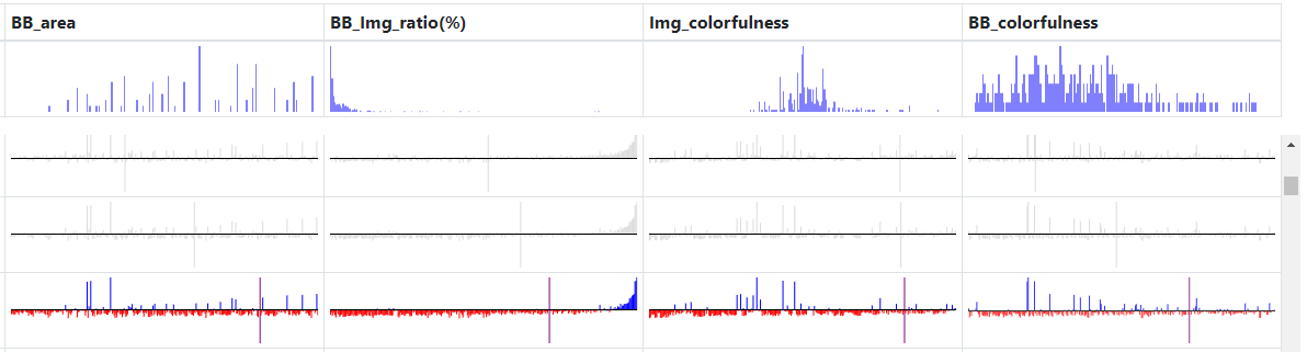
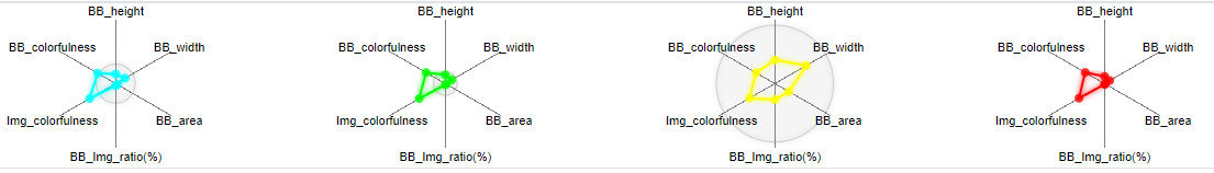
The histogramms, shown in the first row of the picture above, are only static and visualise the distribution of each numerical parameter from the dataset. The attribute table, which are under the histogram row, show for each data entry the current attribute value compared with all other points ordered ascending by the current column. The purple line shows the current point. At mouseover event, the attribute table highlight the activated row. With a double click on this row, a radar chart of the current row is shown in the comparison view section. To remove the radar chart, another double click on the same row is needed. There can be only 4 radar charts at the same time.

The radio buttons are needed to select specific data. The glyphs are only from the dominant points put the attribute view can be selected into skyline point, dominated points or all.
Attention: As in the demo of the based paper , loading more than 200 data rows can lead to some delay.
References
[1] X. Zhao, Y. Wu, W. Cui, X. Du, Y. Chen, Y. Wang, D. L. Lee, H. Qu, "Skylens: Visual analysis of skyline on multi-dimensional data", IEEE Trans. Vis. Comput. Graph., vol. 24, no. 1, pp. 246-255, Jan. 2018.
[2] K. Behrendt, L. Novak, "A Deep Learning Approach to Traffic Lights: Detection, Tracking, and Classification", IEEE International Conference on Robotics and Automation (ICRA), 2017.