AMBIGUITY VISUALIZATION
Wang 2016
Gall Alexander, Heim Anja
WHY AMBIGUITY VISUALIZATION?
These days we face the challenge of interpreting and understanding the nearly inexorable flood of data and information. One technique to provide an intuitive way to explore the specific type of network data is to create node-link diagrams. Huge networks are converted into graphs by using automated layout strategies. These calculations often lead to huge graphs with thousands of nodes and edges, often overlapping each other. So the readability is usually restricted because of these visual ambiguities. Our application "Ambiguity Visualization" can now be used to make these ambiguities visible to the user, so the strengths and weaknesses of the current graph layout can be discovered.
Community Metrics
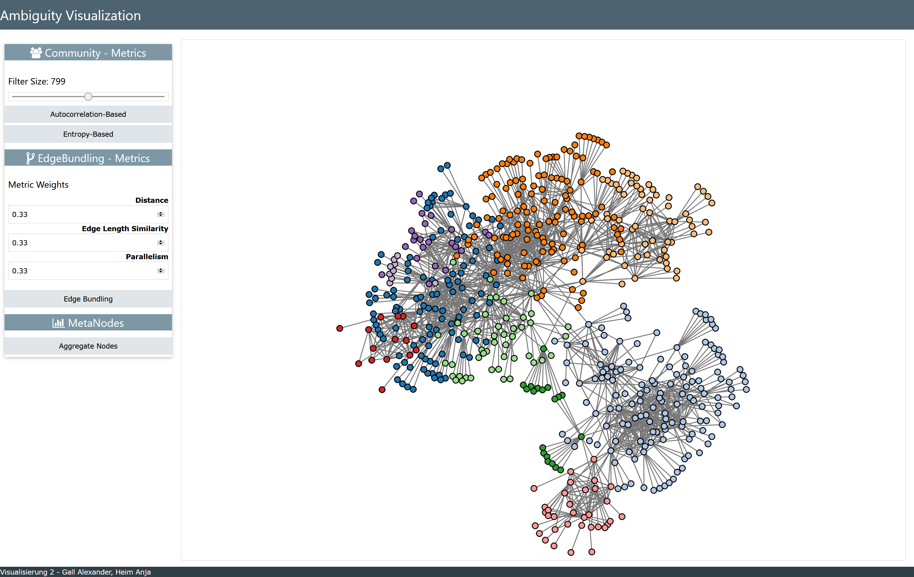
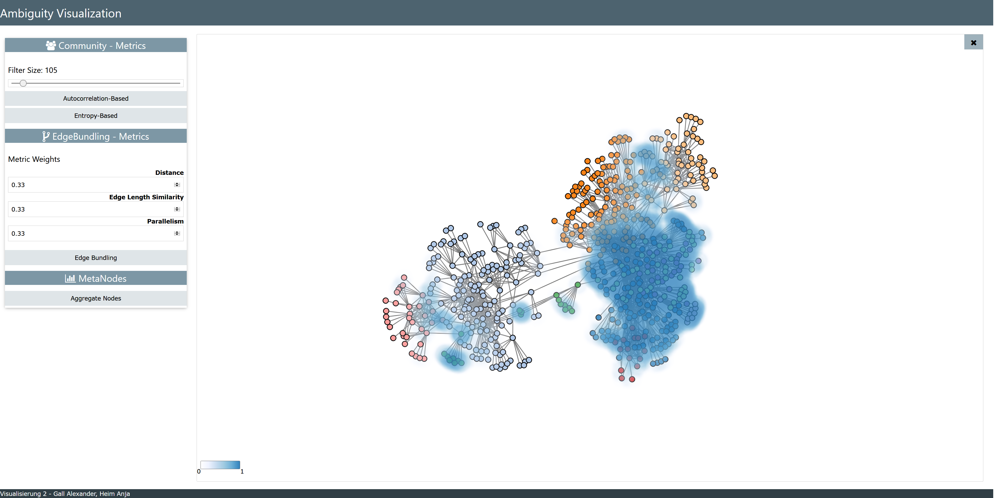
Visual ambiguities not only include overlapping nodes and edges. Furthermore usually nodes are grouped into communities to highlight certain similarities. In this case the question often arises how good these community structures are maintained by the currently used graph layout. To measure the degree of visual overlap between communities, two different metrics have been implemented. The first one is called "Entropy-based Metric". This metric is calculated for a given area centered at a specific node. If the calculated region contains only nodes from one community, the entropy value would be 0, which means that the community structure is preserved perfectly. If the region contains an equal mixture of all communities, the the entropy value reaches a maximum, meaning that the community structure is not represented at all. As already stated this metric quantifies the amount of visual overlap in a specified area, but it does not take the community label of its central node into account. Therefore a second metric called "Autocorrelation-based Metric" was integrated into the application. This metric is also calculated for every node in the graph for a certain squared area. When all nodes surrounding the currently chosen node i come from the same community as node i, then the metric's value is 0, which indicates a perfect preservation of the community structure. However, if the nodes surrounding node i come from different communities, the closer these are to i, in terms of Euclidean distance, the more the community structure degrades from the perspective of node i.
Edge-Bundling Metrics
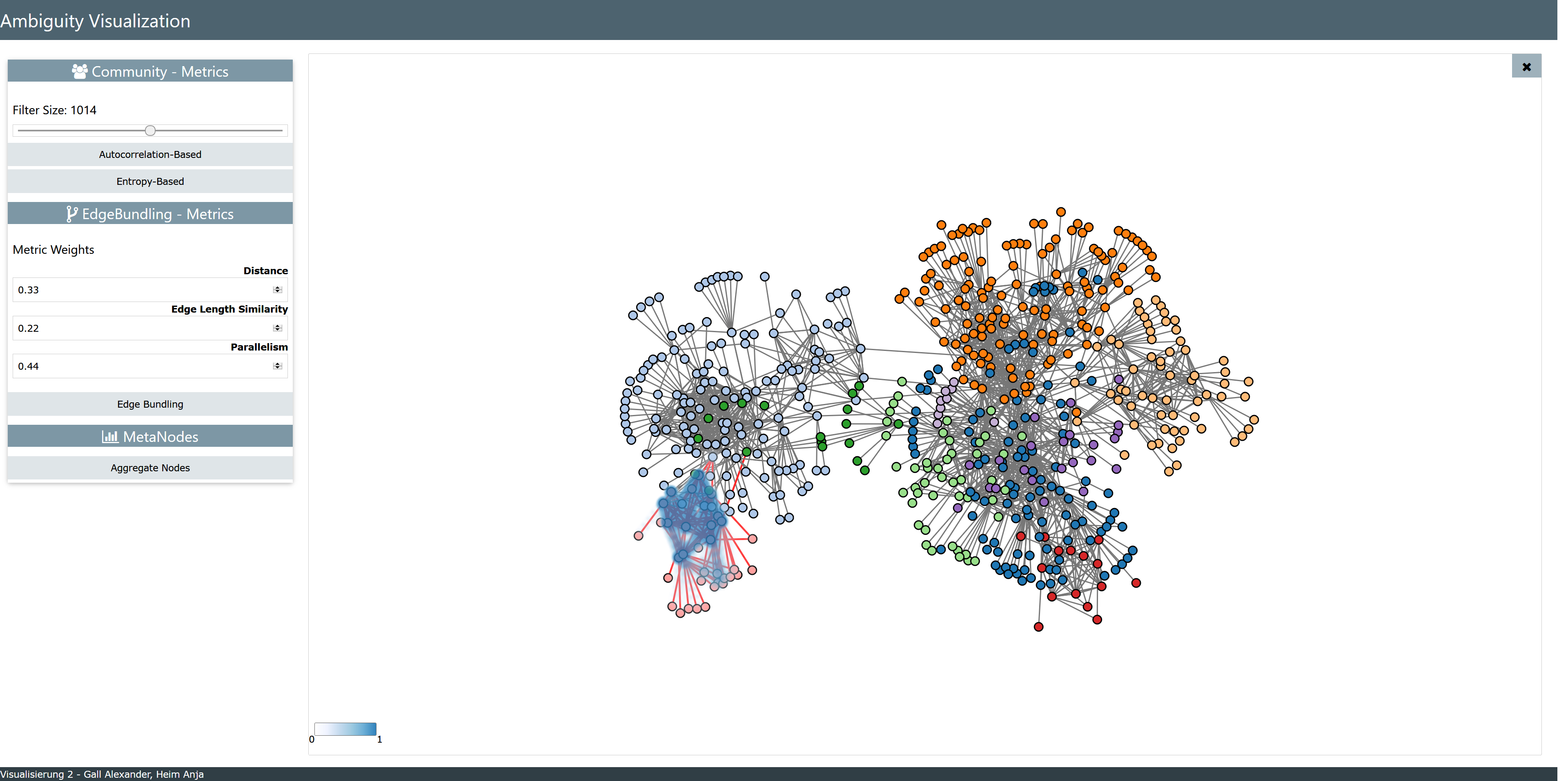
To overcome the ambiguity of overlapping edges, one possibility is to bundle appropriate ones. The problem now occuring is how to choose which edges could be bundled, so that no further ambiguity is added, since for example the user is no longer able to identify which nodes are connected to each other. Therefore three metrics have been implemented, to guarantee, that the bundling edges fit together. The first metric measures the distance between the edges. This shall ensure that only edges, which are lying close together should be bundled. The second metric compares the length of edges to each other, in order to only bundle nearly equally lengthed ones. And the last metric measures how parallel the edges are to each other, so that only very parallel ones are bundled together.
Node Aggregation
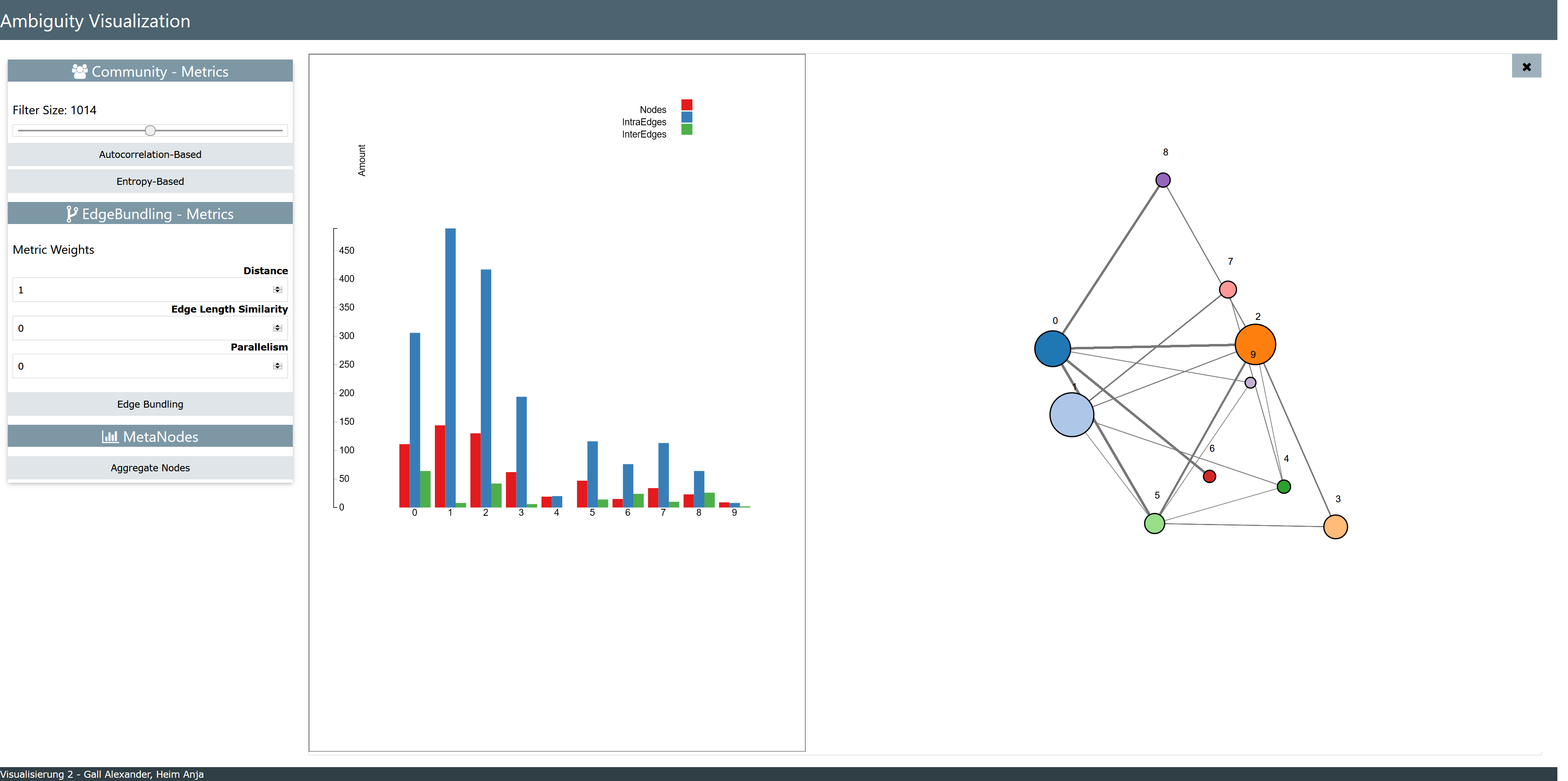
When a graph consists out of many thousand nodes, overlaps can hardly be prevented. One way to get around this type of ambiguity is to create meta-nodes. Since each node belongs to a certain community, one node representing the community can replace all other nodes belonging to this community. So instead of thousands of separate nodes, only as many nodes as community numbers exist. So the size of the graph can be dramatically reduced. In our application the size of one such meta-node is calculated according to the number of nodes belonging to this community. The strength of the links between the meta-nodes is computed according to the amount of connections the communities have in the original graph. So the broader the link, the more connections the communities have. Furthermore a statistic is created for every meta-node which contains data like the amount of nodes belonging to this community, the amount of intra-edges and the amount of inter-edges.
HOW TO USE IT?
Our project is a javscript-web-application. To start the program, simply go to our website:
Ambiguity Visualization
When the website is started the dataset is automatically loaded. In the upper right corner a loading symbol is going to emerge, which indicates how long the graph needs to converge to its finished layout. Afterwards the user is free to choose which metric should be explored first. To investigate the distribution of communities, first a filter size can be set. This size determines the size of the region which is used to calculated the Autocorrelation-based and Entropy-based metrics. To start the computation the respective button has to be pressed. Then the corresponding heatmap will be drawn. For the community metrics, it can be said in general terms, that the more powerful the color, the less is the community structure preserved at this location. In order to see the original graph again, the heatmap can be closed by clicking at the close button on the right upper corner. When the user wants to switch metrics, a click on the button of the desired metric is enough to draw the new heatmap.
When using the metric Edge-Bundling, first the open heatmap must be closed, to be able to select the links, which should be checked for bundling. Note, that not a bundling itself is made, but the metric calculates how suitable these edges would be for a bundling. So the links can be selected by pressing the left mouse button and dragging the mouse over them. The resulting value of this metric is a combination of the three independent metrics: Distance, Edge Length Similarity and Paralellism. On the left menu, weights for the different metrics can be adjusted, but the three weights must sum up to one. So when the user wants to explore them separately, the weight of the metric to investigate should be set to one and the other two to zero. To start the calculation the button with the label "Edge Bundling" has to be pressed. Then a heatmap is drawn, which indicates which links are well suited for bundling and which not.
To explore the meta-node graph and the corresponding statistic, the user only has to press the dedicated button. To go back to the original graph again, the close button can be used.
When the window is changed in size, the graphs layout changes. So a the loading symbol emerges again to show when the metrics can be calculated again. Since the metrics merely describe the ambiguities generated by the layout, they are recalculated when the layout changes. Also when the window's size is changed, while exploring a specific metric, the metric gets deleted and a new graph layout is calculated.
Note: The application has been developed for Firefox Quantum Version 60.0.1 (64-Bit). But it is also working on Microsoft Edge 42.17134.1.0.
ALL ABOUT THE CODE!
The code documentation can be found here: "API"
The source code of the application can be found here: "Source Code"
It can also be found in the API.
The html-code for visualizing the main menu of our application can be explored here as txt.file: "index.html"