Contents
One common way to display time dependent data is to draw every value of a time series as a data point in two dimensions and connect the data points according to their index in the time series. Another way has been successfully implemented in the GapMinder tool. GapMinder is
"GapMinder is a non-profit venture promoting sustainable global development and achievement of the United Nations Millennium Development Goals by increased use and understanding of statistics and other information about social, economic and environmental development at local, national and global levels." (Cite from Gampinder web page)
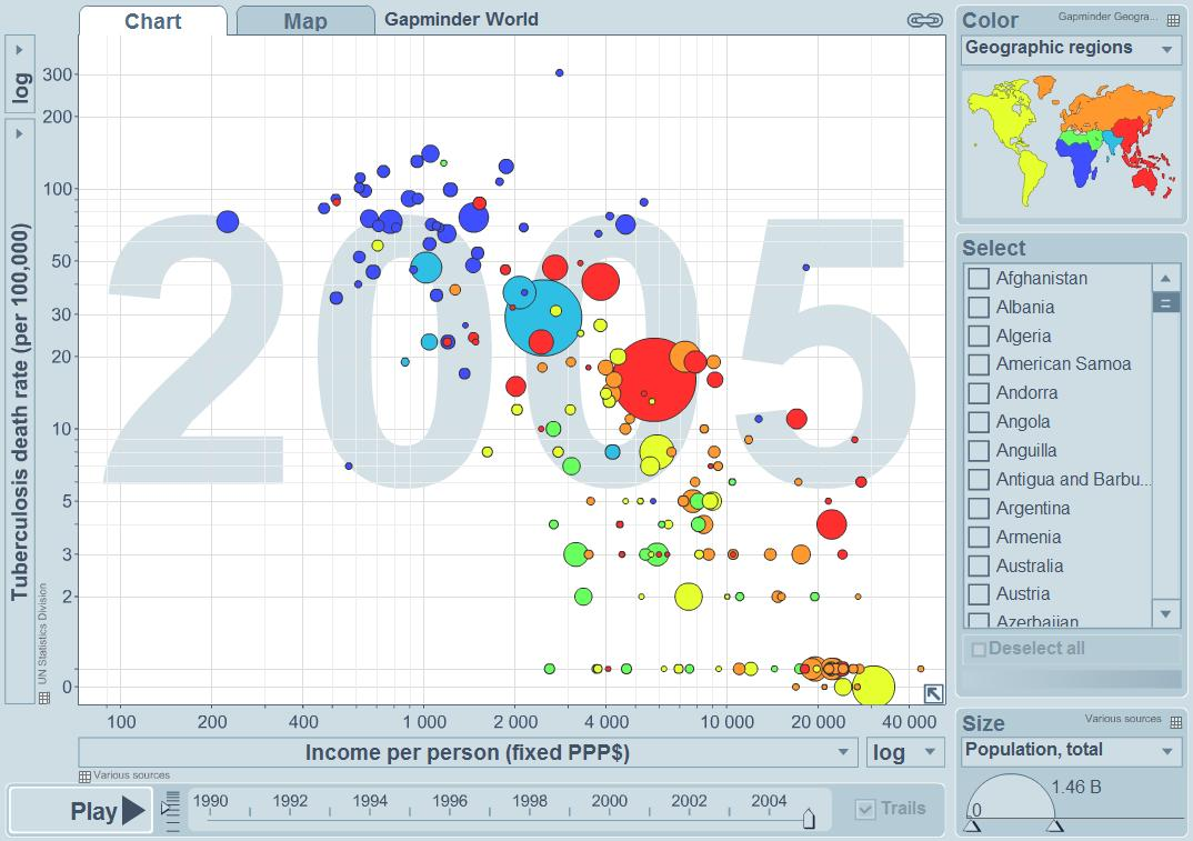
The aim of this lab task was to re-implement as many features from the GapMinder tool as possible. One Snapshot of GapMinder is displayed in Fig. 1.
Our method can be split into two main stages. The loading and the visualization of the data. The visualization depends on the axis data sources and the axis scaling.
Fig. 1: The GapMinder tool as the main motivation for our software.
The software has been implemented in C++, Qt and Visual Studio 2008. The functionality has been split over 100 separate files (*.h and *.cpp). In the following we will consider the features in more detail.
In order to display the time series data accordingly one must construct data files which look like follows:
Fig. 2: One Example data file. 1st Row: Column names (the time columns should be marked as REAL in order to be displayed accordingly), 2nd Row: Column types (NOMINAL, REAL, NUMERIC), all other rows: the actual data where each row represents one time series
If you would like to build your own files you should consider the following rules:
- You must have at least two nominal columns which represent categories.
- You should have at least one column with time dependent data which should be declared as REAL columns.
- The second row in the data file should contain the description of the first row, namely what data types are encoded for the respective columns. Possible options are: NOMINAL (string), REAL (float), NUMERIC (int).
Loading Time Series Data Files
The user interface is straight forward. First, the user loads a *.csv (comma separated values) dataset by clicking on the open source button on the right (see Fig. 3). You can also load multiple tables. The content of the currently selected table is displayed in the data text area control. Here you can see all columns and time series in a raw form.
Fig. 3: The data tab after one data set has been loaded
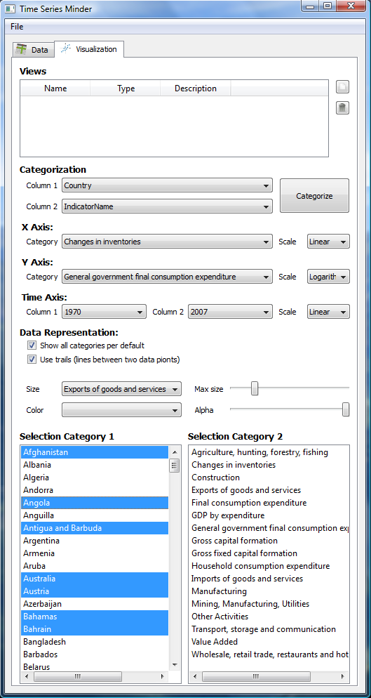
In order to visualize some of the time series you should at least have two distinct nominal categories after which you would like to create categories. A category is then encoded as a data point (category 1) or it is used to display different indicators for the different axes (category 2). You can see in Fig. 4 a configuration example .
Fig. 4: The visualization tab where you can categorize your data table according to two columns. Furthermore you can select the data sources for the different axes and point sizes.
Now, after having the data categorized according to two columns you can choose the data source and scaling for the x and y axis according to the sub-category 2. It sounds complicated but if you see one data file you will know what we mean. You can also change the scaling from linear to logarithmic if you find big differences between the data points.
You should also mark the starting and ending columns for the time axis. Furthermore you can select a data representation mode. The first one (Show all categories per default) can be used to display all categories (see Selection Category 1) not just those which have been selected. The second one (Use trails) can be used to display trails of the selected categories. A trail is just the standardized way to visualize a time series.
Lastly: you can select the indicator for the point size and specify the maximum size of the biggest data point.
The second selection category is just for information purposes and it has no further functionality.
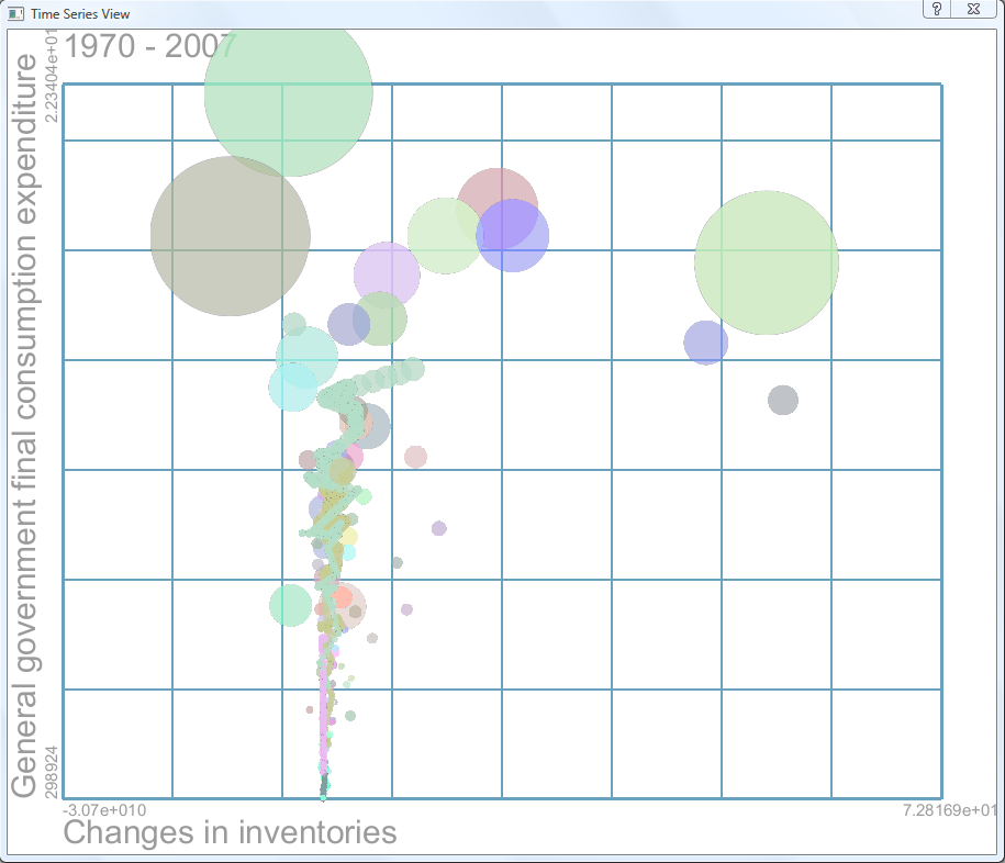
After having specified what your diagram should look like you can add a new view by pressing on the add view button at the right-top side of the visualization tab. What you get is an image like in Fig. 5.
Fig. 5: The visualization result of the selected configurationIn this view you can use the following mouse controls to navigate through the data:
- Right mouse button: Moving the mouse cursor horizontally and pressing the right mouse button leads to change of the current time series. The steps between two time series values have been linearly interpolated.
- Left mouse button: A functionality that has not been finished is the selection of a data point by clicking on the left mouse button.

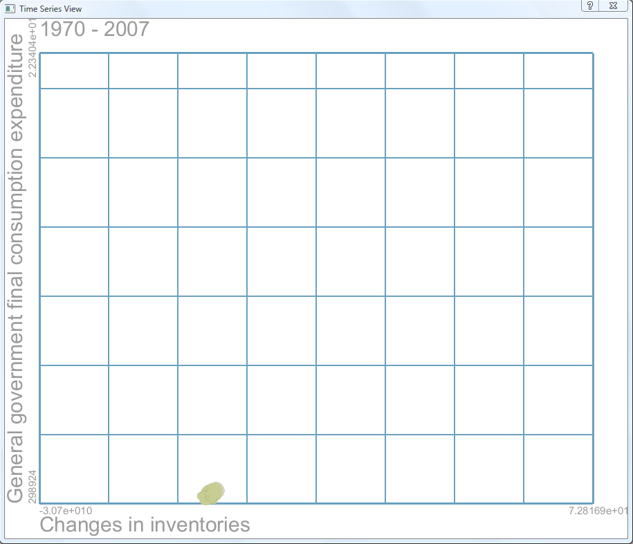
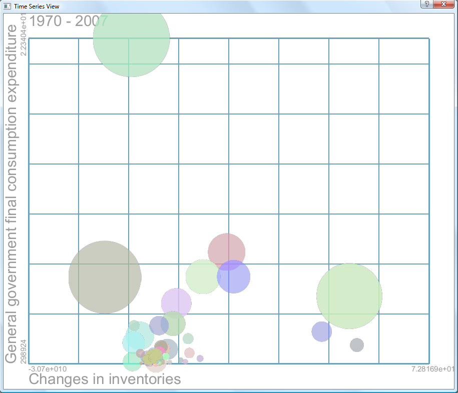
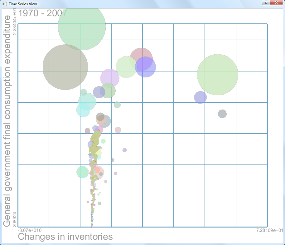
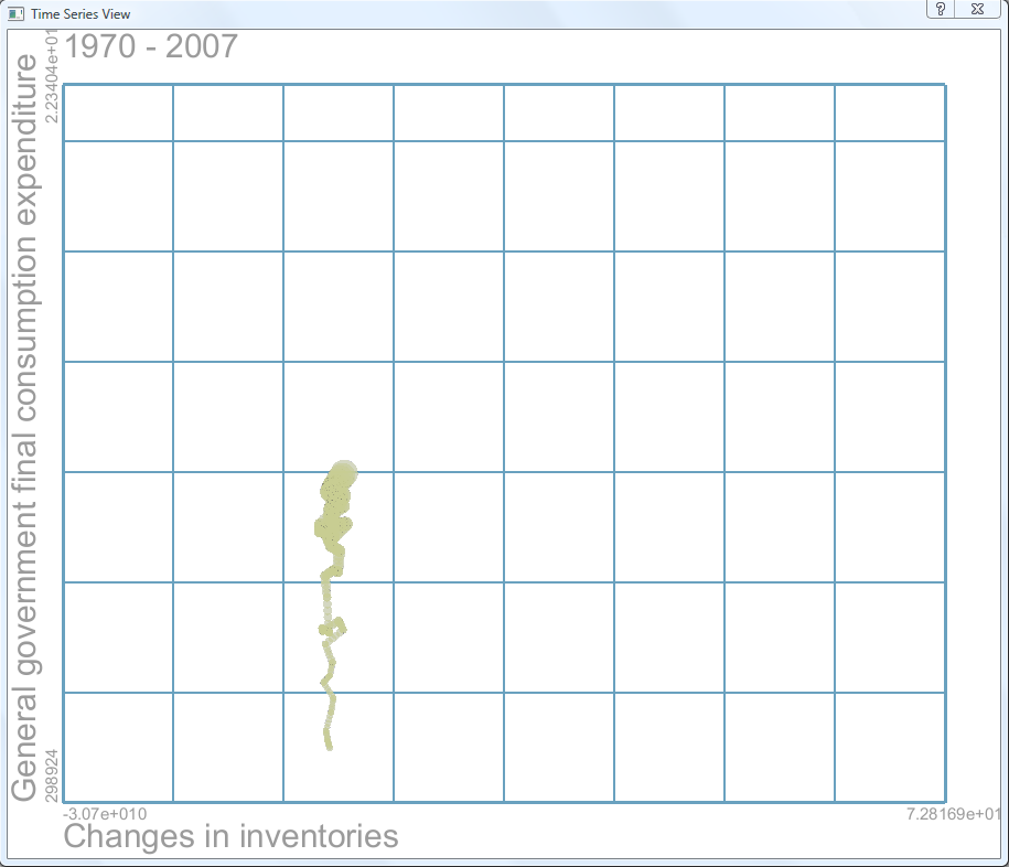
Here are some images produced by this method.
(a) One category selected and the time series is displayed from the year 1970 to 2007
(b) This category in context to other categories for the given time frame.
(c) Same configuration as in (b) but with logarithmic scaling.
(d) Same configuration as in (c) but with context not displayed.
Fig. 6: Some example configurations of the same data set.
- TimeSeriesMinder-exe-x86.rar
- TimeSeriesMinder-src.rar
- You can find some datasets here, here and here. For more datasets look the following sources: