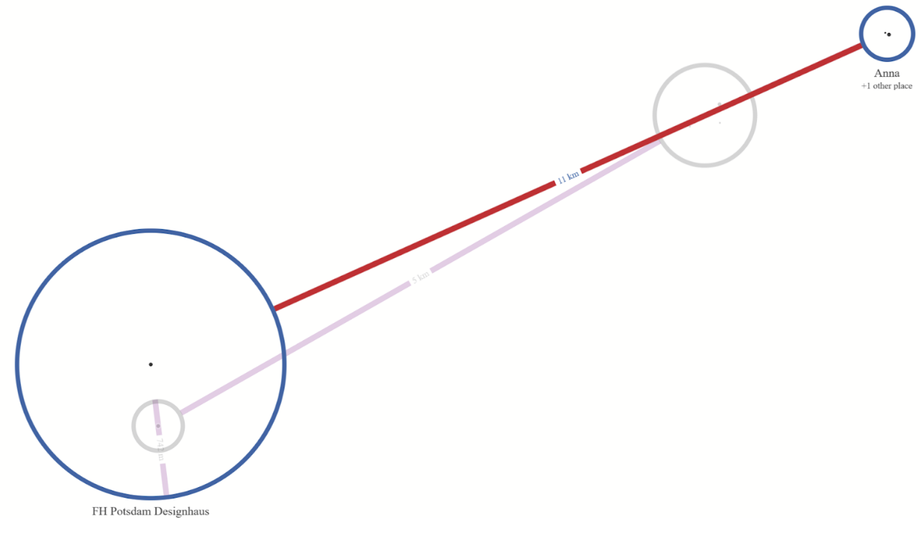
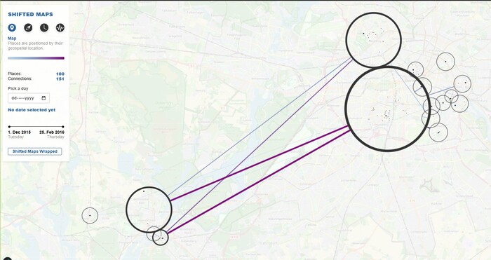
Shifted Maps is a visualization technique that transforms personal movement data into a network of interconnected
map extracts. Visited places appear as nodes and movements between places as edges, enabling exploration of
spatial and temporal mobility patterns.
Our Extensions
We extended Shifted Maps to make it more accessible for general users and to encourage reflection on daily
mobility patterns. Our four extensions are:
Google Maps Timeline integration:
We added an import feature that converts Google Timeline JSON data into the Shifted Maps dataset format.
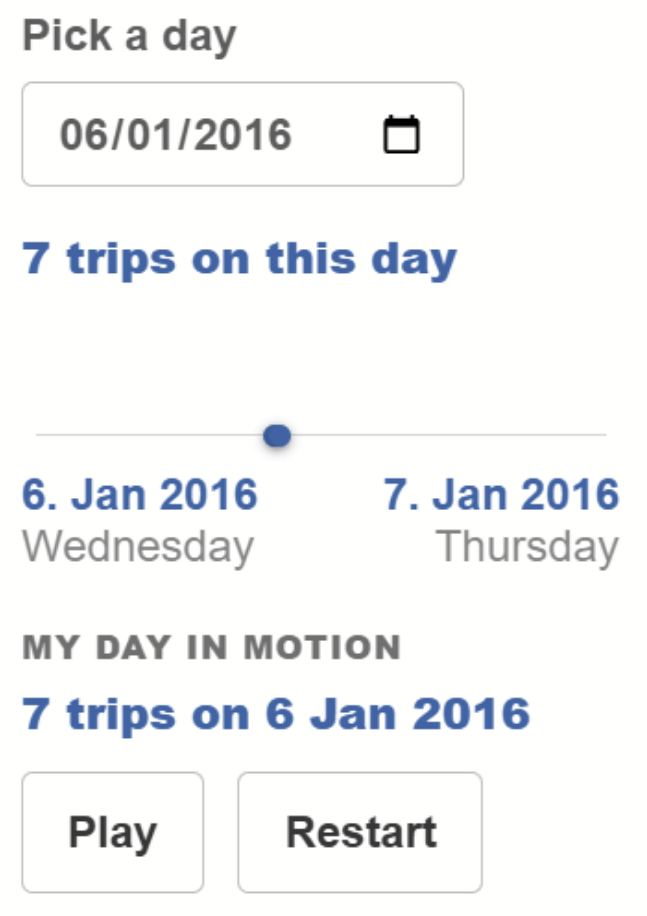
My Day in Motion (24h animation):
A daily playback mode that steps through a full day of movement in chronological order, with playback controls
and reduced idle time for sparse data.
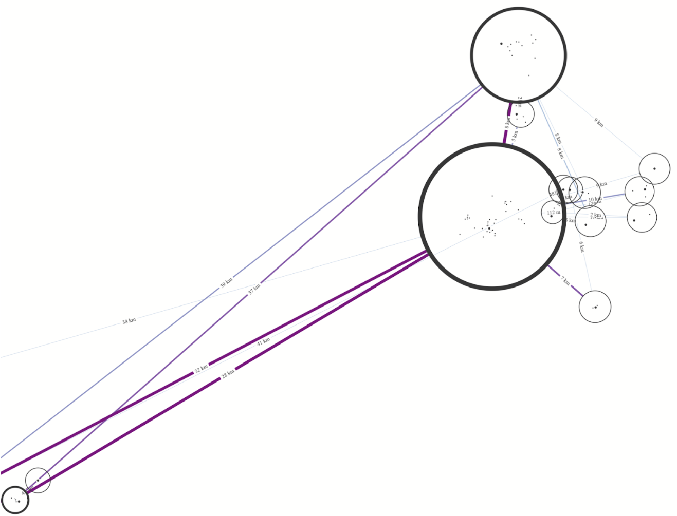
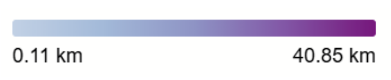
Color-Mapping:
We introduce a color encoding for routes to make frequently used connections stand out at a glance and enhance
interpretability.
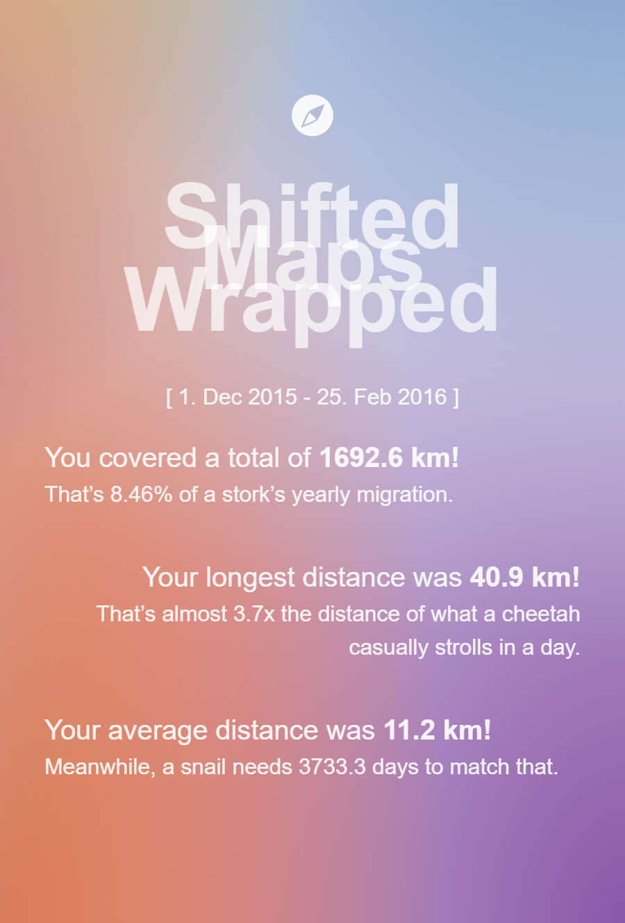
Shifted Maps Wrapped (export):
A “Spotify Wrapped”-inspired export option for sharing a personalized summary of the user’s mobility data.
Screenshots of the implemented Extension Features
Still frame of my-day-in-motion featureUI for my-day-in-motion featureColor-Mapping of Edges corresponding to thicknessColor Legend with current Minimum and MaximumExample of Shifted Maps Wrapped Export
Data Conversion
Google Timeline data is converted server-side using a Python script. During conversion, locations can optionally
be enriched with human-readable place names using OpenStreetMap’s Nominatim reverse-geocoding
service (no API key required).
Supplying a contact email is recommended by the Nominatim usage policy. Requests are throttled automatically and
cached locally to respect rate limits and ensure fast repeated conversions.