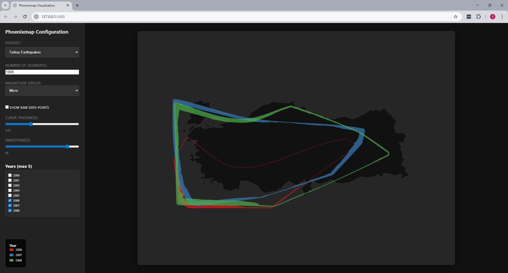
Phoenixmap Visualization
Overview
This project implements the visualization method described in the paper
"Phoenixmap: An Abstract Approach to Visualize 2D Spatial
Distributions"
by Zhao et al. [1]. The Phoenixmap approach identifies the enclosed
outline of a point collection and assigns varied widths to outline
segments based on the density of the corresponding inside regions. This
represents a 2D distribution as an abstract outline with varied
thicknesses, enabling the overlay of multiple distributions for
comparison across categories or time periods.
Usage
Phoenixmap is designed to perceive and compare spatial distribution data
efficiently while freeing up graphical space. Unlike traditional
heatmaps, the concise form of the Phoenixmap allows designers to overlap
multiple outlines on a single map without causing the same level of
visual clutter.
This implementation utilizes yearly data of the following datasets:
-
Chicago Crimes: Shows where different types of crimes
happen in the city [2].
-
African Elephant Sightings: Shows the areas in Africa
where elephants live and how many are found in each spot [3].
-
Turkey Earthquakes: Shows the locations and magnitude
of earthquakes in Turkey [4].
The following configuration variables are exposed to tune the
visualization:
-
Number of Segments: The resolution of the outline.
The paper suggests using numbers such as 1000, 1500, or 3000 to allow
segments to be small enough to fit within individual pixels for high
detail.
-
Curve Thickness: Adjusts the scaling of the curve
width. The algorithm uses a scalar to adjust final widths according to
the size of the graph.
-
Smoothness: Controls the weighted arithmetic mean
calculation applied to density outputs. The paper recommends a window
size between 1/6 and 1/20 of the total number of segments to balance
detail with visual aesthetics.
-
Show Raw Data Points: Allows for the comparison of
the abstract outline against the original dot distribution to verify
range and density.
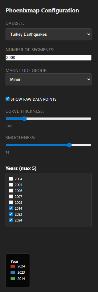
How to Use
The program features an interactive sidebar for real-time configuration
of the Phoenixmap ribbons:
-
Dataset & Category: Use the dropdown menus to select
a dataset (Chicago, Elephants, or Earthquakes) and a specific
magnitude group or crime type.
-
Performance Settings: Adjust the "Number of Segments"
to change the geometric resolution of the ribbons.
-
Visual Sliders: Use the "Curve Thickness" and
"Smoothness" sliders to refine the abstract shapes. Changes are
rendered immediately on the map.
-
Year Selection: The "Years" panel allows you to
toggle specific years on and off. You can overlay up to 5 years at
once for temporal comparison.
-
Data Overlay: Check "Show Raw Data Points" to display
the original coordinates as circles behind the generated ribbons.
Sources
-
[1] Zhao, J., Liu, X., Guo, C., Qian, Z. C., & Chen,
Y. V. (2021). Phoenixmap: An Abstract Approach to Visualize 2D Spatial
Distributions.
IEEE Transactions on Visualization and Computer Graphics,
27(3), 2000-2013.
-
[2]
Chicago Crimes Dataset
-
[3]
African Elephant Sightings Dataset
-
[4]
Turkey Earthquakes Dataset
-
[5] City of Chicago Data Portal:
City Map Boundaries.
-
[6] OpenDataSoft:
World Administrative Boundaries
(Africa and Turkey GeoJSON).