
StackedGraphs - Geometry & Aesthetics
Introduction
The StackedGraphs application was created by Matthias Adorjan and Florian Schaukowitsch as a lab exercise during the course "Informationsvisualisierung" (Information visualization) at the Vienna University of Technology. It presents multiple layers of data (time series) in a common time interval as an aesthetically pleasing stacked graph visualization according to various methods presented in the paper Stacked Graphs – Geometry & Aesthetics by Byron and Wattenberg, 2008.
Implementation
The application is written in C++ using the Qt Framework in version 5.2. It provides a convenient and performant graphics canvas using the QGraphicsScene and related classes. No other libraries are used.
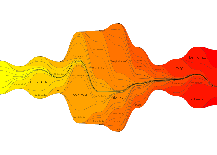
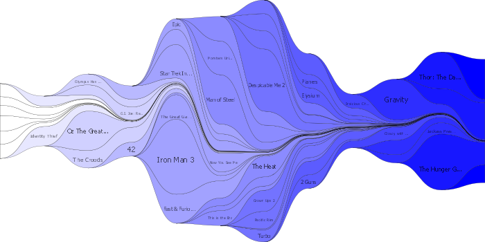
Data is loaded using a simple CSV-based format, or alternatively generated randomly. The included data set shows the top 50 movies of 2013, and their box office revenue. There is also an random data generator, which fills each layer with a number of random Gaussian bumps.
The graph creation is modeled after a pipeline: the layers are first ordered after specific criteria, then an algorithm determines the baseline of the graph (the bottom line on which all layers are stacked) and finally they are colored. An optional step performs labeling of the layers.
Each step can be done by different algorithms and method, which can be selected in the user interface. Sorting can happen according to the first onset time of the layers or the volatility metric which places layers with minimal change in the center of the graph, and larger changes outside. The layers can then be ordered simply by this parameter (OnTop method), alternating on-top/bottom (InsideOut, resulting in early items being placed on the center and later ones around them) or alternating with the sum of a time series as its weight (Weighted).
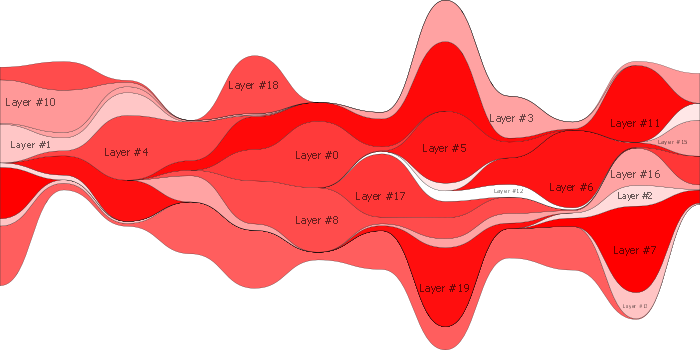
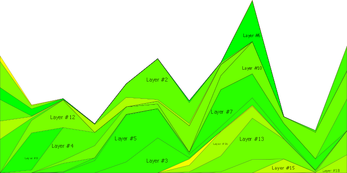
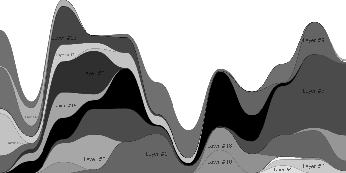
Four different algorithms are available for the calculation of the baseline of the graph. The first method, Stacked, simply sets the baseline to zero, resulting in layers that are simply stacked on top of each other. The second method, named after the ThemeRiver application, chooses the baseline so that the layout is symmetric around the x-axis. The third method, MinWiggle, tries to minimize a "wiggle" metric, which is the sum of squares of the slopes at each time point. This produces a more "even" layout compared to the ThemeRiver method. The final algorithm is the method used in the Streamgraph presented in the paper. This method calculates a "weighted wiggle", which is minimized using numerical integration. The result is that thick layers are treated differently from small ones, improving the visual properties a bit further.
The labels are placed according to a simple brute-force algorithm. For each layer, the algorithm starts at the midpoint of the layer at the time point which has the maximum data value. Now, various x/y translations and font sizes are tried: the bounding box of the label must lie within the layer. If the font size becomes too small during this step, the algorithm is aborted for this layer and it gets no layer at all.
Finally, the layers are colored according to a linear colormap with the endpoints definable by the user. The coloring can depend on the OnsetTime as well as the Volatility attribute. Optionally, one can also weigh the colors according to the total weight of each layer, so that smaller layers are drawn with lighter colors.
The interpolation of the data values is performed using cubic Bezier curves, or optionally linearly to show the available data better.
Interface
The main graph window also allows the user to zoom into the graph and pan it around by using the mouse wheel and dragging with the left mouse button. The vector-graphic nature allows the graph to be crisp and smooth at all zoom levels. The interface of the application is designed to follow the graph creation pipeline. Each step of the pipeline can be configured by the user via the graphical user interface at the left side of the window.
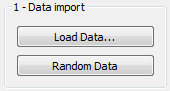
The first part of the pipeline consists of the data import. Here the user can choose either to load the dataset to visualize from a data file or to let the application generate random data to display in the stacked graph.
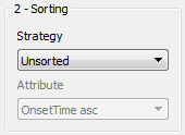
Secondly the data is sorted in a preprocessing step. Here the user can choose to sort after onset time or volatility either descending or ascending. Furthermore the stacking strategy is defined at this stage (OnTop, InsideOut, Weighted)
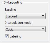
The third stage of the pipeline calculates the baseline of the stacked graph. Here the user can choose between four algorithms (Stacked, ThemeRiver, MinWiggle, Streamgraph). Additionally the interpolation mode can be adjusted at this configuration stage.
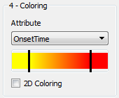
Next the colors need to be assigned to each layer. The user can choose the attribute which is used to calculate the color (OnsetTime, Volatility). Of course it is also possible to define the color gradient applied to the layers. The user can choose the start and end color of the linearly interpolated gradient.
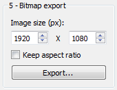
As an optional fifth pipeline stage the user can also export high-resolution bitmap images of the graph, optionally keeping the same aspect ratio as the display.
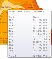
When clicking on a layer, one gets additional information about it in a popup, showing all the data values for this layer.
Screenshots
Contact
This application was created by Matthias Adorjan and Florian Schaukowitsch. You can reach us by Email: