"The main idea behind a stacked graph (...) is to show many individual time series, while also conveying their sum. Since the heights of the individual layers add up to the height of the overall graph, it is possible to satisfy both goals at once." [1]
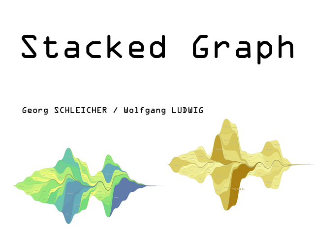
Based on the paper "Stacked Graphs – Geometry & Aesthetics" written by Lee Byron and Martin Wattenberg we developed a software capable of visualizing time series as a stacked graph (with our provided testdata we show movie revenues over time). With geometry and aesthetics in mind a graphical end-user application with intuitive interaction possibilities was build using C++ and Qt (qt.nokia.com) for cross-platform compatibility.
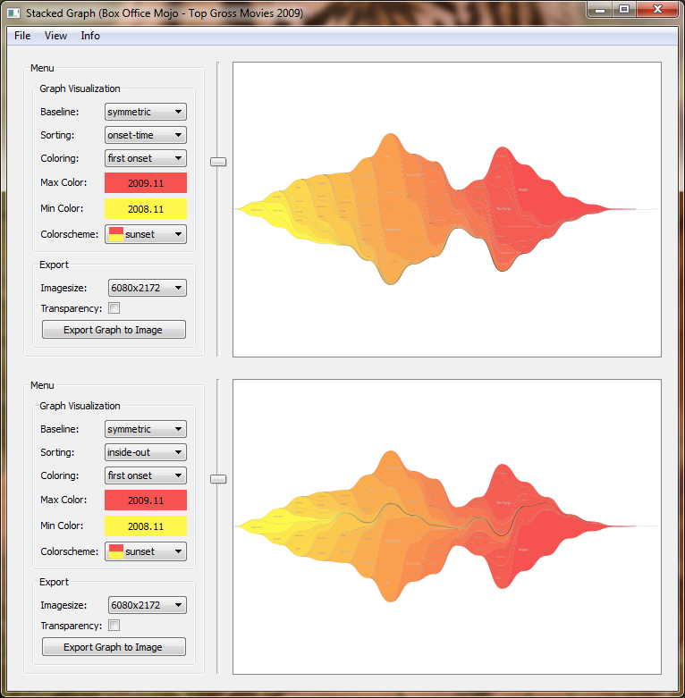
This application shows how stacked graphs can be presented beyond the classical approach by using pre-painting data sorting algorithms as well as layouting and coloring techniques.
Data can be loaded by using File -> Load Data. A file dialog will pop up and let you choose one of the provided *.data files. By confirming the file dialog the data gets loaded and instantly a stacked graph is drawn.
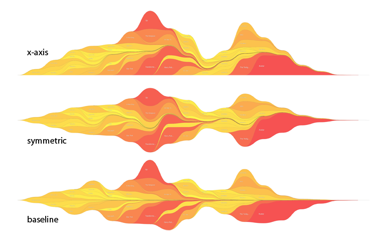
There are 3 different baseline modes available. They set the baseline of the graph so that:
There are 3 different sorting modes available. When a timeline starts, it is:
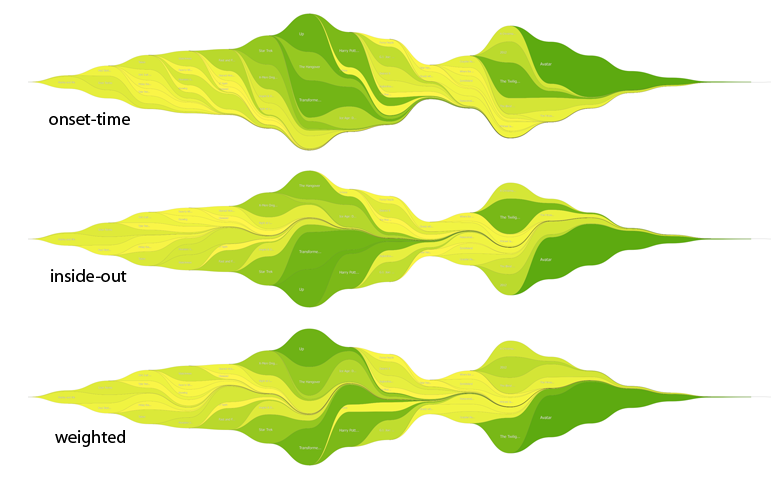
More information on datasorting and baseline selection can be found at [1].
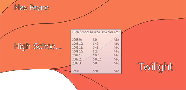
It is possible to view the data of one time series by clicking the second mouse button while the cursor is over the desired time series. A tooltip with the data will show up. For better readability the data is divided by 1000 (unit size steps) till it is more readable. If the detailed data is needed, it can be activated with View -> Detailed Information.
The graph can be zoomed in and out with the mouse wheel. When zoomed in you can pan the graph by using first mouse button and dragging the graph.
By pressing third mouse button the whole graph will be shown again and centered.
The graph height can be changed with the slider to the left of the graph. This might be useful if the graph is too high or too low or if you want to achieve a special height:width ratio for your image export.
For algorithm comparison purpose the application supports a compare graph split view which can be shown by activating View -> Compare Graph.
Color plays an important rule because it can be used to distinguish between time series but also to transport additional information.
Therefore there are 5 different coloring modes available. They color the time series in regard to their:
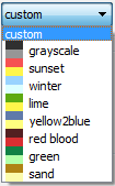
The software provides the user with predefined colorschemes that can be selected with a drop-down-menu. The defined colorschemes help to create a colorful graph with only a few clicks.
Additionally to the predefined colorschemes the user can create an individually colorramp using a colorpicker. By pressing on one of the two currently active colors a colorpicker appears and let the user choose and set a custom color.
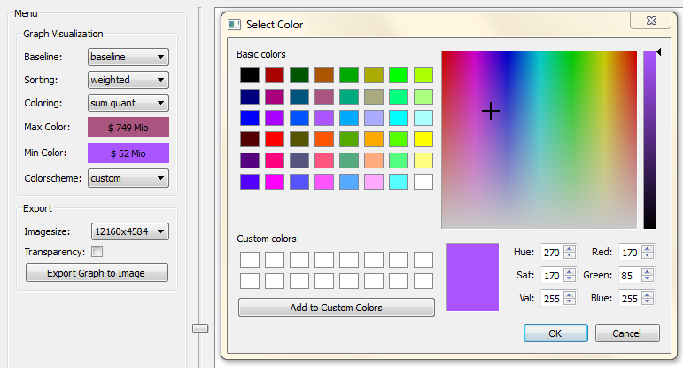
Note: By choosing a color the active colorscheme, visible in the drop-down-menu, changes to "custom".
A white fontcolor with a black borderstroke was used to maintain readability in every situation. The Labels stay readable no matter how dark or bright the background's color is.
You can get detailed information on a time series by clicking with the second mouse button on the desired series. This will bring up a semi-transparent tooltip as shown below.
The graph can be exported as a high resolution PNG image. You can choose from 5 output sizes and enable/disable transparency of the background.
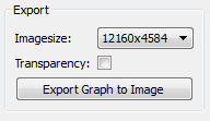
If transparency is set the background will be rendered 0% opaque - otherwise colored white. By clicking on "Export Graph to Image" a file dialog comes up allowing you to select the prefered saving destination and naming.
OpenGL accelerated drawing can be enabled via View -> OpenGL if your graphics card supports OpenGL and OpenGL samplebuffers. Otherwise OpenGL options will be grayed out.
By activating "Auto OpenGL" via View -> Auto OpenGL the application tries to use software rendering mode as long as image quality and speed is satisfying - otherwise switches to OpenGL rendering mode. Especially when zoomed and panning the graph OpenGL rendering mode is much faster than software mode.
You can download:
This page is valid XHTML/CSS and written by Wolfgang LUDWIG and Georg SCHLEICHER.
Sourcecode documentation was created with Doxygen.
This application was created based on:
[1] "Stacked Graphs – Geometry & Aesthetics" written by Lee Byron and Martin Wattenberg, IEEE TRANSACTIONS ON VISUALIZATION AND COMPUTER GRAPHICS, VOL. 14, NO. 6, NOVEMBER/DECEMBER 2008